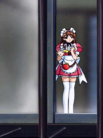
Hand Maid May 3
Created/Updated 2001-02-18
- Catalog Number : PIBA-1230
- Manufacturer : Pioneer
- Series : Hand Maid May
- Printing Date : 2000-12-22
- Region : 2
- Price : Y5,775
- Play Time : 50 minutes
- Number of Discs : 1
- Number of Sides per Disc : 1
- Number of Layers (side1) : 1
- Number of Layers (side2) : N/A
- Audio1 : Japanese Dolby Digital 2ch
- Audio2 : N/A
- Audio3 : N/A
- Audio4 : N/A
- Audio5 : N/A
- Subtitle1 : N/A
- Subtitle2 : N/A
- Subtitle3 : N/A
- Subtitle4 : N/A
- Subtitle5 : N/A
Animephile Rating: C (7.0)
- Video Scan Type : interlaced-TV (-2.5) -
dTV can detect 3:2 pulldown fairly well.
- Aspect Handling : standard (-0.0)
- Compression : -0.0
- Video Separation : -0.0
- Scene Transition : -0.0
- Calibration : -0.5 -
I can't believe I'm saying this, but it has too much contrast. Whites
are too hot.
Comments:
Animation style used for Hand Maid May is not really my type. Lines
are used very boldly but sparingly and color boundaries are extremely
clear. Overall proportions are fairly realistic, though. Despite the
fact that I don't like this style, I have nothing against the art work
because it is not sloppy. I mean that care has been taken to draw the
characters unlike Love Hina.
I'm not too sure what to make of it. I currently only have one DVD.
I got it for the BOX. It appears to be one of those typical Pioneer
titles created by womanizers. Supposedly, this series still has a
heart-warming story behind all the "show-offs" if you know what I
mean, but I don't see it in this volume. If you've watched the whole
series and think it's worth it, convince me to buy the whole thing.
My e-mail address is on the main page.
On an unrelated note, the cover-art for the DVD itself is underneath
the top-layer polymer, so it looks really neat. It's kind of like a
very clear picture underneath a thin glass.
Anyway, I've got one image for you. Look at how overemphasized the
whites are.
Images:

