Comic Party 1
Created/Updated 2001-08-12
- Catalog Number : KSXA24111
- Manufacturer : K.S.S.
- Series : Comic Party
- Printing Date : 2001-06-22
- Region : 2
- Price : Y2,800
- Play Time : 43 minutes
- Number of Discs : 1
- Number of Sides per Disc : 1
- Number of Layers (side1) : 1
- Number of Layers (side2) : N/A
- Audio1 : Japanese Dolby Digital 2ch
- Audio2 : N/A
- Audio3 : N/A
- Audio4 : N/A
- Audio5 : N/A
- Subtitle1 : N/A
- Subtitle2 : N/A
- Subtitle3 : N/A
- Subtitle4 : N/A
- Subtitle5 : N/A
Animephile Rating: F (5.5)
- Video Scan Type : progressive (-0.0) -
It's not properly progressive. It goes back and forth all over the place.
It's actually kind of interesting. It's as if they're using dScaler type 3:2
pulldown detection mechanism except it's too slow and inaccurate. It goes
back to interlaced 30fps immediately after a transition and then when (and if)
it figures out the correct 3:2 pulldown sequence, it goes back to progressive.
Sometimes, though, it is in progressive mode even though it really shouldn't
be. For example, there's at least one scene where two transposed frames are
moving against each other where one is in correct pulldown and the other
isn't. Since both images are soft, it's not too bothersome, but it is still
wrong.
- Aspect Handling : standard (-0.0)
- Compression : -0.0
- Video Separation : -2.5 -
There's unbelievable amount of crawlies on some objects on the screen. I say
"unbelievable" because I've not seen anything this bad on any of the recent R2
releases. It is extremely bothersome to me.
- Scene Transition : -0.0
- Calibration : -0.5 -
Whites are too hot. It reminds me of "Hand Maid May."
- Other : -1.5 -
Because it's not really progressive.
Comments:
The mere fact that Comic Party is closely related to "To Heart" is
enough for me to collect them. It's actually quite funny and possibly
informative. Animation is one of the best I've seen from cell-less TV-series.
Hopefully, we'll get more cameo appearences by To Heart characters.
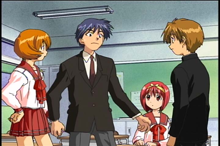
Image1: I'm not Hiroyuki!!!
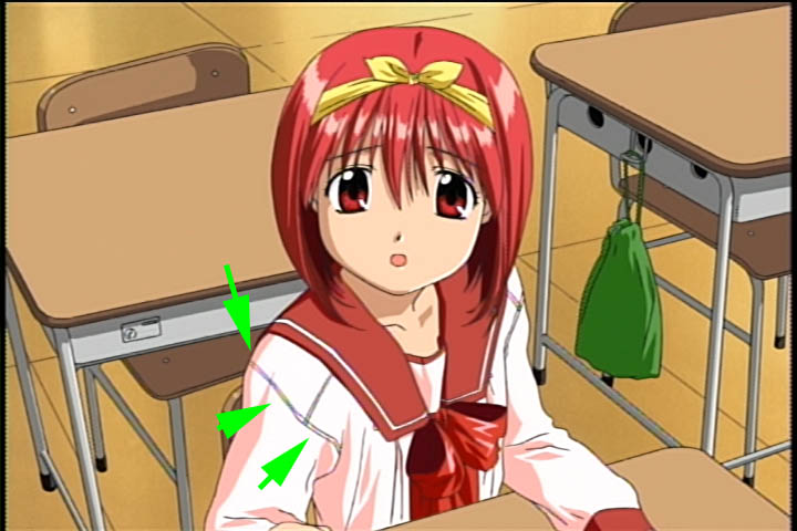
Image2: (high-quality JPEG) Notice the rainbowing? Also, when you look at
this quickly, you're going to think that it's sharper than what you're used to
seeing from the real "To Heart" screenshot. Unfortunately, that is not true.
Original "To Heart" images are sharper. This computer-generated image has
precise color boundaries (Chroma) so it looks like it has more definition, but
once you take away the color information, one will see that all the lines are
fuzzy. This is a standard practice with all CG anime. This is one of the
more easily explainable reasons why I prefer cell animation over computer
animation.
Images:


